

Bowtie Chart
Box and Whisker Chart
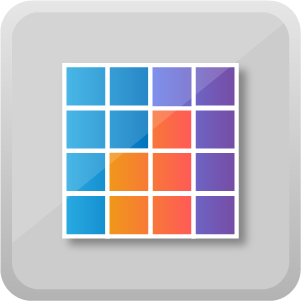
Brick Chart
Circular Gauge
Clustering using OPTICS

Cylindrical Gauge
Data Insights
Dot Plot
Dumbbell Chart
Dynamic Tooltip
Funnel with Source
Forecast using Neural Network
Gantt Chart

Grid
Histogram With Points
Horizontal Funnel
Journey Chart
KPI Column
KPI Grid
KPI Ticker
Linear Gauge
Quadrant Chart
Ring Chart
Rotating Chart

Rotating Tile
Slope Chart

Text Wrapper

Thermometer

Trading Chart
Venn Diagram

Use Bowtie Chart by MAQ Software to quickly compare values in one or more categories. The thickness of the bowtie's branches indicates the relative weight of each category. Users can create a half bowtie, showcasing the distribution of data within a source. Or, by entering values in the source, destination, and value fields, users can create a full bowtie, showcasing how an aggregate value splits into two distinct sub-categories.
Bowtie Chart by MAQ Software is ideal for displaying sales metrics, such as the flow of channel category sales into subcategory sales.
Key features:
- Configurable branch color.
- Configurable font-size, color, and decimal precision for data labels and summary labels.
- Optional use in either half bowtie or full bowtie format.
For any feature requests or questions about this visual, please send an e-mail to our team at Support@MAQSoftware.com.
See in AppSource
Box and Whisker Chart by MAQ Software is useful for quickly comparing distributions between several sets of data. In addition to showing the median, first and third quartiles, and the maximum and minimum values, Box and Whisker Chart by MAQ Software displays the mean, standard deviation, and quartile deviation.
This visual is useful for any application that requires comparing large datasets in a compact space.
Key features:
- Display parent and child data segments.
- Flip or swap axis data points based on reporting requirements.
- Choose different shapes (circle, square, rectangle) for mean and data points.
For any feature requests or questions about this visual, please send an e-mail to our team at Support@MAQSoftware.com.
See in AppSource
Brick Chart by MAQ Software allows users to display a percentage breakdown of a category in an alternative format to a donut or pie chart. This visual is useful for showing percentages or positions occupied, such as seats in a legislature. It is also useful for comparing each portion of a category to the whole.
Key features:
- Tooltip to indicate the category each color represents and its corresponding percentage.
- Option to include a legend with a customizable title, size, and color.
- Customizable chart width and height.
For any feature requests or questions about this visual, please send an e-mail to our team at Support@MAQSoftware.com.
See in AppSource
Circular Gauge by MAQ Software shows the progress of a task in a circular chart. Progress is shown either as the actual value or as a percentage of the target value. Users can display the visual in either a pie or a donut chart format. Users can also set a threshold value for the chart.
Circular Gauge by MAQ Software is useful for displaying key performance indicators (KPIs), such as sales achieved against a set target.
Key features:
- One color illustrates actual progress and the other displays the target.
- The percentage displayed on the report tracks progress against the target.
- Text size and ring size are customizable.
For any feature requests or questions about this visual, please send an e-mail to our team at Support@MAQSoftware.com.
See in AppSource
Clustering using OPTICS by MAQ Software analyzes and identifies data clusters. The algorithm relies on density-based clustering, allowing users to identify outlier points and closely-knit groups within larger groups. This visual includes adjustable clustering parameters to control hierarchy depth and cluster sizes. R package dependencies (auto-installed): Dbscan, plotly, ggplot2.
Key Features:
- Data is scaled and pre-processed automatically, eliminating the need to do so externally..
- Hover tooltips and zoom effects.
- Capability to manually adjust the parameters of the clustering model.
For any feature requests or questions about this visual, please send an e-mail to our team at Support@MAQSoftware.com.
See in AppSource
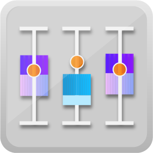
Cylindrical Gauge by MAQ Software allows users to compare actual values against a target capacity. Each gauge in this visual represents a single metric.
Cylindrical Gauge by MAQ Software is useful for evaluating inventory, average customer satisfaction scores, fuel, or other repository levels.
Key Features:
- Define the minimum and maximum values of tick marks.
- Customize the fill and border color of the cylinder.
- Navigate the visual with a vertical scrollbar when height restrictions limit visibility.
- List the value of the fill line below the cylinder for added clarity.
For any feature requests or questions about this visual, please send an e-mail to our team at Support@MAQSoftware.com.
See in AppSource
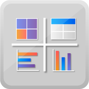
Data Insights by MAQ Software allows users to view data in multiple formats and quickly narrow data results. Users can switch between horizontal bar, vertical bar, brick, or tabular formats. With Data Insights by MAQ Software, users can easily explore data, select specific data, and view selected data in the format that best fits individual business needs.
Key features:
- Display data in bar, brick, and tabular formats.
- Custom text and background colors.
- Tooltips with additional insights.
Business Applications:
- Display multiple sales KPIs simultaneously.
- Shift between multiple KPIs or reporting periods by changing the axis base.
For any feature requests or questions about this visual, please send an e-mail to our team at Support@MAQSoftware.com.
See in AppSource
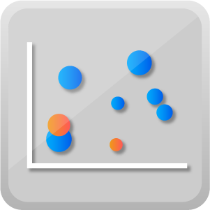
Dot Plot by MAQ Software displays data points (bubbles), plotted on an X/Y axis, and distributed over a desired set of values. The size of the bubble represents the magnitude, and the color represents the category. Users can view data through multiple parent and child sub-categories, a significant improvement over other dot plot diagrams.
Dot Plot by MAQ Software is useful for displaying multi-dimensional sales data in one visual, such as sales quantity per year over various regions.
Key features:
- Support for selection and multi-selection with partial highlighting.
- Display distinct bubble color for different categories.
- Modify bubble size and bubble animation on click.
For any feature requests or questions about this visual, please send an e-mail to our team at Support@MAQSoftware.com.
See in AppSource
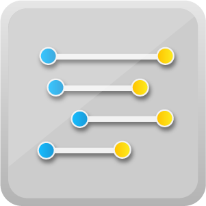
Dumbbell Chart by MAQ Software helps users analyze changes in critical data. This visual consists of a dual-axis combination chart: one axis of is marked by a circle, the other is marked by a line that spans data points provided by the user. Dumbbell Chart by MAQ Software is ideal for illustrating change and comparing the distance between data points. R package dependencies (auto-installed): plotly and ggplot2.
Key features:
- Display the performance of multiple indicators.
- Compare the growth or loss of indicators across various categories.
- Quickly download an image of the chart with the capture image widget.
For any feature requests or questions about this visual, please send an e-mail to our team at Support@MAQSoftware.com.
See in AppSource
While most available tooltips only display static information, Dynamic Tooltip by MAQ Software displays both static text and dynamic data fetched from a data source. If the data from the data source changes, the tooltip will update automatically. Dynamic Tooltip by MAQ Software is also useful for adding visual aids and indication images, such as a glowing bulb icon in the corner of a chart that suggests to the audience that clicking the icon will yield “tips.”
Key features:
- Enables static and dynamic tooltips for report charts.
- Customized icon image configuration.
- Formatting options for decimals and display unit data.
For any feature requests or questions about this visual, please send an e-mail to our team at Support@MAQSoftware.com.
See in AppSource
Forecasting using Neural Network by MAQ Software implements an “Artificial Neural Network” to learn from historical data and predict future values. This visual uses a single layer feed forward network with lagged inputs to process time series values. R package dependencies (auto-installed): forecast, plotly, zoo, xts.
Forecasting using Neural Network by MAQ Software is useful for forecasting budgets, sales, demand, or inventory.
Key features:
- Ability to use years or distinct numerical values in place of date and time field. (The visual will work for both numerical series, i.e. years or numbers, and proper date and time values).
- Hover tooltips and highlighting of specific portions of the plot.
- Capability to manually adjust the parameters of the learning model.
For any feature requests or questions about this visual, please send an e-mail to our team at Support@MAQSoftware.com.
See in AppSource
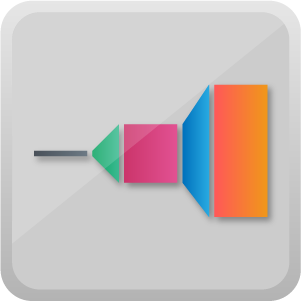
Funnel with Source by MAQ Software shows a funnel journey for any metric or data point. This visual allows users to follow the path of a metric over various stages, as well as track the entry channel through which the metric reached the funnel.
Funnel with Source by MAQ Software is excellent for visualizing sales paths. It showcases the channel through which a lead enters the funnel and the lead's corresponding journey through the various stages of the sales cycle.
Key features:
- Filter data based on the channel selected and on the selection of any stage of the sales journey.
- Support for cross-visual filtering.
For any feature requests or questions about this visual, please send an e-mail to our team at Support@MAQSoftware.com.
See in AppSource
Gantt charts are used for scheduling and task management. Ordinary Gantt charts only display basic details such task IDs, names, and schedules. Gantt Chart by MAQ Software includes a grid that allows users to view data related to the task and the hierarchy of data categories. Users can sort the data based on any data point contained in the task.
With Gantt Chart by MAQ Software, project managers can monitor project IDs, start times, end times, current status, project duration, project owners, and task priorities, as well as many other KPIs. Users can also view individual tasks and their progress.
Key features:
- Task details on grid with hierarchy.
- Showcase the task status as of the current date.
- Sort data based on any parameter of grid.
- Display tooltips for column headers, category labels, KPI indicators, data labels, and bars.
For any feature requests or questions about this visual, please send an e-mail to our team at Support@MAQSoftware.com.
See in AppSource
Grid by MAQ Software allows users to present specific data from a complex dataset. This visual enables users to navigate large datasets and focus on the most important items. Pagination facilitates easy navigation. Users can also sort data based on any column.
Key features:
- Users can add an image to the grid using a URL.
- Support for multiple data formats including CSV.
- Support for special characters.
For any feature requests or questions about this visual, please send an e-mail to our team at Support@MAQSoftware.com.
See in AppSource
While histogram charts are good at illustrating the density of distributed data, they normally do not show specific values. Histogram with Points by MAQ Software addresses this issue by combining a histogram chart with points that show the actual data for each range.
Histogram with Points by MAQ Software is useful in many business applications, such as displaying employee salary distribution as well as salary variation for individual employees in specific salary ranges.
Key features:
- Show or hide points and histogram bars.
- Show or hide the X-axis, Y-axis-right, or Y-axis-left.
- Show or hide gridlines.
For any feature requests or questions about this visual, please send an e-mail to our team at Support@MAQSoftware.com.
See in AppSource
While other Power BI funnels are limited to displaying one key metric for each funnel stage, Horizontal Funnel by MAQ Software allows users to display a second, customizable metric beneath the primary measure. The secondary measure defines the size of the colored funnel segments. For example, users can call out the dropout value or percentage next to the primary measure.
Horizontal Funnel by MAQ Software is useful in many applications, including sales pipeline analysis (allowing users to view both the sales process and conversion rates at each stage), website traffic analysis, order fulfillment, or any business process analysis that involves multiple stages.
Key features:
- Display a secondary measure below the colored bars.
- Tooltip to display a brief explanation of the data.
- Change the color configuration of the funnel stage and change the color, font size, display units, and decimal places of the labels.
For any feature requests or questions about this visual, please send an e-mail to our team at Support@MAQSoftware.com.
See in AppSource
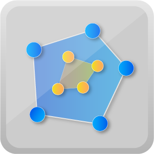
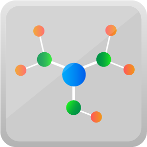
Journey Chart by MAQ Software lets users display complex, multi-stage lead paths in a clean, uncluttered visual. In this visual, nodes represent categories and vertices represent relationships between categories. The bigger the node or vertex, the larger the value. Customizable node colors make distinguishing between categories easy.
Journey Chart by MAQ Software is useful for explaining process flow, uncovering underlying patterns, highlighting subcategories stemming from a single source, and showing connections between categories.
Key features:
- Text labels and tooltips for each node provide information such as title or value.
- Customize colors and sizes for text labels.
- Option to add a legend to clarify complex graphs.
For any feature requests or questions about this visual, please send an e-mail to our team at Support@MAQSoftware.com.
See in AppSource
KPI Column by MAQ Software is a combination of a line and column chart where each column value changes color depending on its relation to a target line value. Columns represent performance and lines represent KPI targets.
KPI Column by MAQ Software has many business applications including measuring sales, revenue, or profit data against target values.
Key features:
- Include an optional target value that's common for all columns.
- Represent forecasted data in columns, using the same target line.
- Display forecasted columns in a translucent color to differentiate from actual values.
For any feature requests or questions about this visual, please send an e-mail to our team at Support@MAQSoftware.com.
See in AppSource
KPI Grid by MAQ Software allows users to track productivity and performance data by displaying key data in hierarchical order. Users can specify the time periods shown, making gauging performance according to internal deadlines and benchmarks easy.
KPI Grid by MAQ Software is useful for adding visual interest to reports, such as yearly sales data. In addition to displaying the data, users can add images to emphasize trends.
Key features:
- Include custom images such as rising or falling arrows.
- Include separators between columns, highlighting certain categories for quick comparison.
- Change row background colors, text size, and text color.
For any feature requests or questions about this visual, please send an e-mail to our team at Support@MAQSoftware.com.
See in AppSource
KPI Ticker by MAQ Software saves space on your reports by displaying multiple KPIs in a series of rotating tiles. Show the percentage increase or decrease of each value and quickly alert viewers of positive, negative, and neutral changes with an optional color-coded trend indicator.
KPI Ticker by MAQ Software works great in applications with frequently changing metrics such as values for multiple stocks or flight delay information for multiple carriers.
Key features:
- Adjust the number of tiles in each row and their background color.
- Change the font size and color.
- Customize the colors of positive, negative, and neutral trend indicators.
For any feature requests or questions about this visual, please send an e-mail to our team at Support@MAQSoftware.com.
See in AppSource
Linear Gauge by MAQ Software shows progress toward a target value, such as achieved sales versus targetted monthly sales. This visual allows users to include multiple data points, which is useful for illustrating trends such as monthly or year-to-date (YTD) completion rates. Information displayed includes the present value, percentage toward completion, and two optional trend values.
Key features:
- Set the minimum and maximum value of the metric.
- Customize the color of the gauge and data labels.
- Choose from six unit options for the metric.
For any feature requests or questions about this visual, please send an e-mail to our team at Support@MAQSoftware.com.
See in AppSource
Quadrant Chart by MAQ Software is a bubble chart with a background divided into four equal sections. This visual is useful for plotting data that contains three measures using an X-axis, a Y-axis, and varying bubble sizes that represent the value of the third measure.
Quadrant Chart by MAQ Software is useful for showing relationships, such as the relationship between production cost and gross profit. Users can place cost values on the X-axis and profit on the Y-axis. The four sections rate the performance (cost vs. profit) as bad, good, better, or best. Bubbles in each quadrant represent the health of each respective quadrant. The size of the bubble represents the number of units sold. Quadrant Chart by MAQ Software is compact, yet shows a great deal of information.
Key features:
- Customizable bubble colors.
- Formatting options for quadrants and quadrant lines including naming for each quadrant, X-axis division line, Y-axis division line, and a choice of dotted or solid lines.
- Custom title, title text, labels, display units, and decimal points for each axis.
For any feature requests or questions about this visual, please send an e-mail to our team at Support@MAQSoftware.com.
See in AppSource
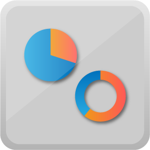
Ring Chart by MAQ Software breaks large sums into smaller data slices. The size of each slice is relative to the data itself. The center of the ring displays a dynamic KPI and summary. Threshold values define the color and direction of the indicator.
For example, to display the contribution of various channels to the total sales, data for channels such as e-mail, store, and online can be represented as slices of the ring. In this scenario, the entire ring represents total sales.
Key features:
- 3D visual feedback when highlighting specific slices.
- Display raw data in legend, along with toggleable KPI indicators.
- Showcase multiple data fields in tooltips.
For any feature requests or questions about this visual, please send an e-mail to our team at Support@MAQSoftware.com.
See in AppSource
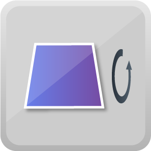
Rotating Chart by MAQ Software is a horizontal bar chart that rotates on the horizontal axis to showcase multiple KPIs. Each flip can have a new value based on the number of KPIs that need to be displayed. For better visibility, users can set a timer for the rotation delay.
Business reports often require many KPIs in a single report, especially when showcasing historical data. Rotating Chart by MAQ Software lets users display multiple KPIs or metrics in a small viewing area, saving space on lengthy reports.
Key features:
- The tile can be rotated on the horizontal or the vertical axis.
- Flip delay time can be specified, ensuring that all data shown in the tile is readable.
- Includes a 3D effect option, emphasizing when different data is displayed.
- Includes basic formatting options such as font type, size, and color for the label and title, background, and tile borders.
For any feature requests or questions about this visual, please send an e-mail to our team at Support@MAQSoftware.com.
See in AppSource
Rotating Tile by MAQ Software is a tile that displays one KPI value at a time before flipping to the next value. This visual is useful for showcasing multiple KPIs or metrics on a single report.
One use for Rotating Tile by MAQ Software is showing many KPIs in a limited space on a year-end financial report.
Key features:
- Tile can be rotated on the horizontal or the vertical axis.
- The flip delay time can be specified, ensuring that all data shown in the tile is readable.
- Includes a 3D effect option, making noticing data changes easier for viewers.
- Includes basic formatting options for the label and title, background, and tile borders, including font type, size, and color.
For any feature requests or questions about this visual, please send an e-mail to our team at Support@MAQSoftware.com.
See in AppSource
Slope Chart by MAQ Software allows users to analyze trends in data at a glance. This visual is useful for comparing interactions between two data points based on time or other user-chosen parameters. R package dependencies (auto-installed): plotly and ggplot2.
Key features:
- Quick comparison of indicator growth or loss across categories.
- Easy interaction with many data points using zoom functionality.
- Quickly download an image of the chart with the capture image widget.
For any feature requests or questions about this visual, please send an e-mail to our team at Support@MAQSoftware.com.
See in AppSource
Text Wrapper by MAQ Software retrieves text from any data source and wraps it within the target field, presenting the text in a readable format. This visual also wraps static text strings (statements) with dynamic text field values.
Key Features:
- The dynamic text field value updates according to the selected filter or slicer, keeping the static text intact.
For any feature requests or questions about this visual, please send an e-mail to our team at Support@MAQSoftware.com.
See in AppSource
Whether measuring event registrations, sales data, or online conversions, Thermometer by MAQ Software is the perfect tool for visualizing progress toward a target goal.
Key features:
- Set the fill and border color of the thermometer.
- Adjust the minimum and maximum value of the scale.
- Turn off the tick bar for a minimalist look.
For any feature requests or questions about this visual, please send an e-mail to our team at Support@MAQSoftware.com.
See in AppSource
Trading Chart by MAQ Software lets users enter historical trading records and translates them into a simple chart. Gray bars signify low and high price values. Red or green bars superimposed over the low and high values show which direction the stock moved.
Key features:
- A red bar indicates a stock’s price has dropped; a green bar indicates the price rose.
- Customizable price ranges and time increments.
For any feature requests or questions about this visual, please send an e-mail to our team at Support@MAQSoftware.com.
See in AppSource
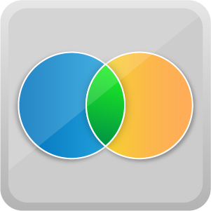
Venn Diagram by MAQ Software displays logical relationships between a collection of datasets, each represented as a circle. The intersection of the circles illustrates the qualities that are shared by the overlapping datasets.
One use for Venn Diagram by MAQ Software is showing employee involvement in various products or services. Users can quickly display which employees are involved with which products, and where overlaps between teams occur.
Key features:
- Customizable names and colors for each circle or dataset.
- Labels let users easily distinguish between individual values and intersected region values.
- Users can hover their mouse over different regions, showing individual and intersected values.
For any feature requests or questions about this visual, please send an e-mail to our team at Support@MAQSoftware.com.
See in AppSource